Why Re-Design This Website?
I recently thought of designing an UI for an ecommerce based website using figma tool. So when i was browsing for inspirations across various ecommerce websites.
I came across this Dogchew website. while analyzing this website i discovered few problems and started thinking of the possible solutions in which this website user experience can be enhanced. That's how i thought of taking up this as a personal project of redesigning the Dogchew Ecommerce website.
DISCLAIMER : THIS IS A PERSONAL PROJECT AND I WAS NOT COMMISSIONED BY THEM TO REDESIGN THEIR WEBSITE.
Here are the few problems i felt while i was analyzing this website
DISCLAIMER : THIS IS A PERSONAL PROJECT AND I WAS NOT COMMISSIONED BY THEM TO REDESIGN THEIR WEBSITE.
Here are the few problems i felt while i was analyzing this website
* I felt the shop and categories tab in navigation bar is redundant and looked bit confusing.
* Mission of their brand is placed at bottom . I felt it could have placed at first section banner .so when users first visits this website it creates first impression by building trust on their brand.
* Categories is again repeated in second section which i felt could have been eliminated.
* Since the categories of their products are limited, In the third section i felt the discount of their product could have been made visible and straight forward for the user to decide and take action.
Step By Step Explanation of my Redesign page
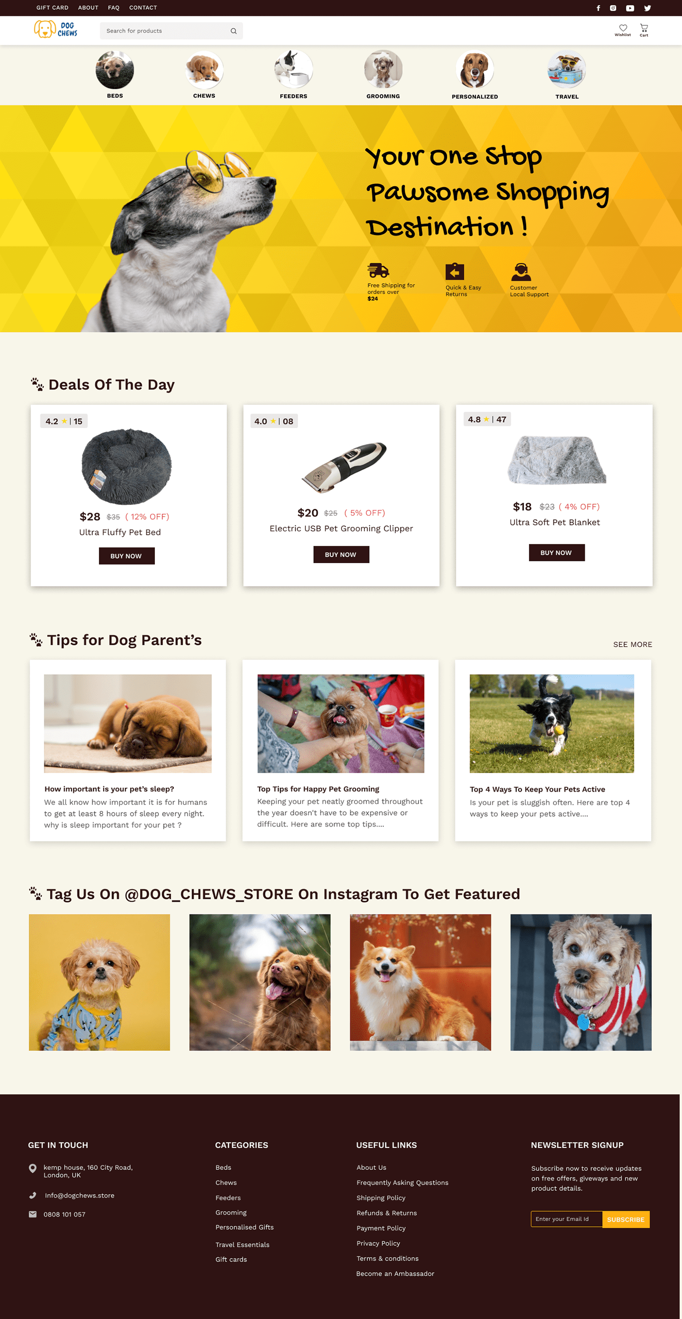
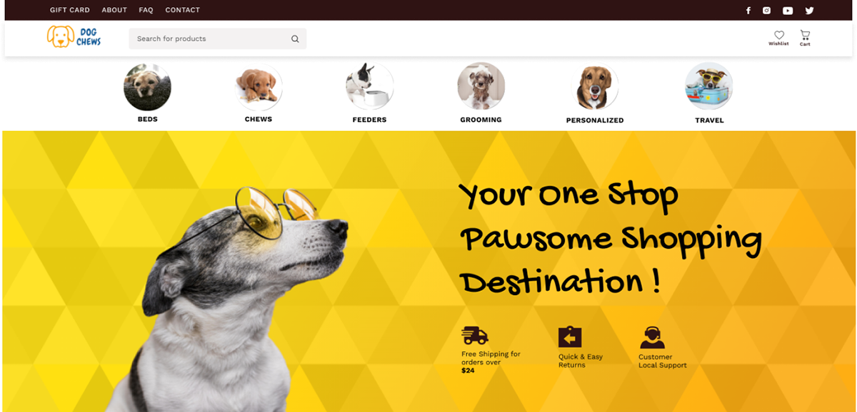
1 ) Hero page section
OLD DESIGN:


NEW DESIGN
Research says that It takes 2.6 seconds for a user’s eyes to land on the area of a website that most influences their first impression.
Thats why its important to have first section of website impactful to create that first impression to our users. So listing my thought process in creating this first hero section of this website.
1. Since the categories are limited . I have redesigned the navigation bar by making it more visible and specific to choose from directly in a click.
2. Added the other information from the old navigation bar at top most bar and made the social links visible at top to also emphasis their brand's social media presence when user first visits to this website.
3. Enhanced the banner of the hero section by adding catchy headline, stylish dog picture to give this website a feel of trendy collection instore and added the trust building factors (free shipping, quick and easy returns, customer local support) visible to users by adding at topmost section to create the first impression.
2 ) Second section
OLD DESIGN

NEW DESIGN

I made the discount more visible and attractive by directly showing the products
with clear call to action. so i feel this straight forward approach will influence the decision
of the users to take action quicker.
with clear call to action. so i feel this straight forward approach will influence the decision
of the users to take action quicker.